Pantone vs CMYK Printing: When Each Color System Makes Sense
The useful answer is straightforward: choose CMYK for photographs, multicolor artwork and economical process printing; specify a dedicated Pantone spot ink when one or a few colors must remain tightly controlled or sit outside the practical CMYK gamut. The decision is not really Pantone versus CMYK as competing color languages. It is whether a named color should run as its own ink separation or be simulated with process inks.
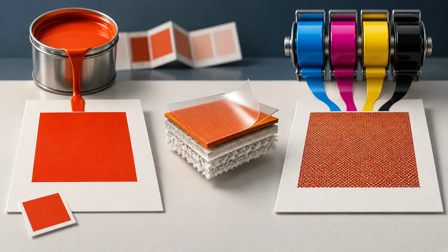
That distinction resolves much of the confusion around Pantone vs CMYK printing. Pantone is a color-standard system containing different kinds of references, while CMYK is a printing method that forms colors from cyan, magenta, yellow and black. A Pantone-named color may be printed as a dedicated spot ink, approximated in CMYK, or simulated through another process-color system. Those outputs can look similar, but they are not physically equivalent.
Pantone vs CMYK printing at a glance
| Production need | Dedicated Pantone spot ink | CMYK process printing | Practical choice |
|---|---|---|---|
| Brand mark using one critical color | Ink is mixed or selected to target the specified spot color and printed on its own separation | Color is simulated with halftone combinations of cyan, magenta, yellow and black | Use a spot ink when the agreement requires a physical spot-color target; otherwise approve a CMYK simulation for the actual press and stock |
| Photographs and multicolor illustrations | Each extra spot color adds another ink or imaging requirement and is unsuitable for reproducing normal full-color photographs by itself | Designed to reproduce continuous-tone imagery through four process separations | Use CMYK |
| Bright orange, vivid green or other difficult hue | May reach a color that falls outside the selected CMYK printing condition | May produce a visibly duller or shifted approximation | Compare a physical spot reference with a profiled process proof |
| Short-run digital output | Many digital devices simulate the named color rather than load a dedicated Pantone ink | The RIP converts or maps artwork into the device’s available colorants | Ask whether the job uses a real spot colorant or a digital simulation |
| Job containing CMYK plus one critical brand color | Adds a fifth separation and potentially another press unit | Converting everything to CMYK can simplify production but changes the brand color | Balance color importance against press configuration, proofing and cost |
| Packaging or labels with repeated production | A controlled spot-ink target can make the requirement explicit across runs | A controlled process workflow can also repeat well, but the simulation depends on the output condition | Define measurement conditions, substrate and tolerances instead of relying on the color name alone |
A Pantone color is not automatically a spot ink
Pantone publishes solid-color references, CMYK references and comparison resources such as Color Bridge. They answer different questions. A solid guide communicates the appearance of a formulated spot color on a stated type of stock. A CMYK guide presents process-color results. Color Bridge helps compare a solid Pantone reference with a process approximation. Interchanging their numbers without checking the guide and output method can create a specification that looks precise but remains ambiguous.
In production software, a spot color is a color assigned to a separately named plate or channel. In conventional printing, that separation normally requires its own plate and ink station. It can be used instead of CMYK on a one- or two-color job, or added to CMYK as a fifth color.
A digital press may preserve the spot name in the PDF but still map it to its installed toner or ink set. The name can help the RIP identify the intended target, yet it does not prove that a premixed physical ink will be used. Ask the printer directly: “Will this output as a dedicated colorant, or will the RIP simulate it?” That question is more useful than asking whether the device “supports Pantone.”
Why the CMYK conversion changes from job to job
There is no single universally correct CMYK recipe for every Pantone color. A CMYK build describes amounts of process color, but the resulting appearance depends on the complete printing condition: ink set, press behavior, screening, substrate, calibration and color profile. The same percentages can produce different measured colors on two presses or on coated and uncoated stocks.
An ICC output profile describes the capabilities and limitations of a particular device or printing condition. Color-managed conversion uses that information to map source colors into the available output gamut. The International Color Consortium’s introduction to output profiles is useful background for understanding why a conversion should target a defined condition rather than generic “CMYK.”
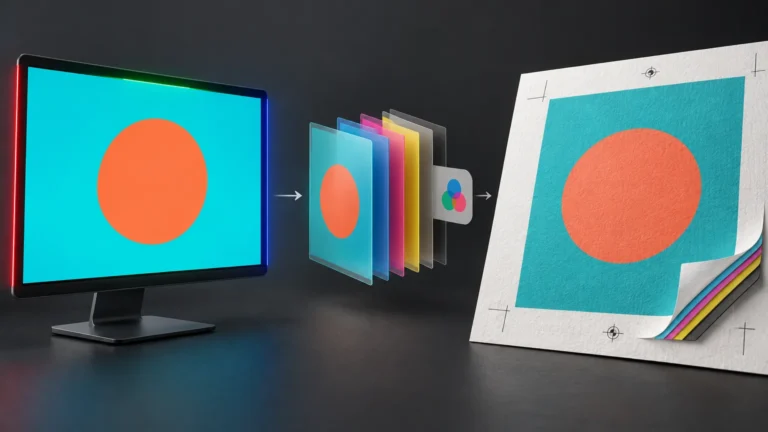
For a fuller explanation of source spaces, output profiles and conversion points, see what changes when RGB and CMYK artwork leaves the screen. The same principle applies here: numbers acquire meaning only in relation to a color space or output condition.
Substrate and finishing are part of the color result
Ink does not float independently of the printed object. Uncoated paper absorbs and scatters light differently from coated stock. Clear film, metallic material and colored vinyl add their own optical behavior. Lamination and varnish can change gloss, contrast and the way a sample looks under directional light.
On transparent or colored materials, a white-ink underbase may be needed beneath process or spot colors. Its opacity and registration affect the apparent color. Printing without white allows the substrate to participate in the result; printing over white creates a more opaque visual base. A transparent file area, white artwork object, white substrate and printed white ink are separate production instructions, as explained in this guide to transparent and white backgrounds.
Metallic inks create another exception. Their reflective pigment and viewing-angle effects cannot be represented faithfully by ordinary CMYK on white paper. A screen preview may communicate placement, but it cannot reproduce the physical reflection of the ink or foil.
Proof the production condition, not just the artwork
A monitor preview is useful for composition and relative color relationships, especially on a calibrated display with the intended profile. It is not physical evidence of how ink, paper, opacity and finishing will interact. A desktop print from an unrelated printer is also not a contract for what the production press will deliver.
For color-sensitive work, establish which proof answers which question:
- PDF proof: checks content, dimensions, fonts, image placement, spot names, overprint settings and technical construction.
- Soft proof: predicts the profiled output condition on a controlled display, within the limits of the monitor and simulation.
- Calibrated physical proof: predicts a defined production condition and can provide a measurable approval target when the proofing workflow supports the required inks.
- Wet proof or press drawdown: shows actual ink and substrate interaction, making it useful for difficult spot colors or specialty stocks.
- Press approval: evaluates production sheets during the run, ideally against an agreed reference and under specified viewing conditions.
Recognized process-control standards provide context for this discipline. ISO 12647-2 addresses process control for halftone separations, proofs and production prints in offset lithography. It does not turn every press into the same press, but it illustrates why defined conditions and controlled measurements matter.
Use Delta E only with an agreed measurement method
A spectrophotometer can compare a printed sample with a target and express the difference numerically. X-Rite, for example, documents spectrophotometric tools for measuring and validating process and spot-color inks in print and packaging workflows.
A Delta E value is not a complete specification on its own. The parties must agree on the color-difference formula, instrument geometry, illuminant, observer, measurement mode, backing, sample preparation and acceptance tolerance. Changing those conditions can change the reported value. There is no responsible universal tolerance for every product, substrate and customer expectation.
Spot inks can also require characterization beyond the ordinary process-color output intent for reliable communication and proofing. ICC guidance discusses the additional information needed when documents contain spot inks. A practical purchase specification should therefore state both the visual reference and how compliance will be judged.
How to prepare a reliable spot or process-color file
The file should make the production intent explicit without unnecessarily destroying useful color information. Before export, use this checklist:
- Decide whether each named Pantone color must run as a dedicated ink or may be simulated with the printer’s process colorants.
- Confirm the exact library, color designation and coated or uncoated reference used for approval.
- Keep an intended spot color as a named spot swatch. Do not create several nearly identical swatches with different names.
- Ask for the production output condition, ICC profile or printer-specific conversion instructions before committing to CMYK values.
- Inspect the separation preview. A spot job should show the expected named plate; a CMYK-only job should not contain accidental extra spot plates.
- Check overprint and knockout behavior. White objects set to overprint can disappear, while overlapping spot colors and transparency can produce unexpected separations.
- Review gradients, raster effects and placed images. A spot swatch applied to a vector object does not automatically make every linked or rasterized element a clean spot separation.
- Export using the printer’s requested PDF standard and settings. Preserve spot colors when they are supposed to remain spots.
- Approve a proof that represents the intended press, substrate and finishing closely enough for the color risk involved.
- Record the approved target, measurement method and retained sample when repeatability across future runs matters.
Worked example: a brand sticker and a photographic card
Consider a company ordering a recurring logo sticker in one vivid orange. The artwork contains only orange and white, and the orange is central to recognition. A dedicated spot ink may make sense if the selected production method can run it economically and the buyer requires a physical spot-color match. If the sticker is digitally printed, however, the provider may simulate that orange with process colorants. The buyer should approve the simulation on the actual white vinyl, clear film or other selected material rather than assume the Pantone name guarantees the same appearance.
If the project moves from technical planning to ordering custom stickers, the production note should identify the material, whether white ink is required, whether the Pantone target is a dedicated ink or a simulation, and what proof must be approved. A Pantone number by itself leaves those construction decisions unresolved.
Now consider a product card containing photographs, shadows, gradients, colored typography and the same orange logo. CMYK is the practical base because the photographs already require process printing. The orange can either be simulated within that CMYK image or added as a fifth spot ink. The fifth color may be justified for a large campaign with strict brand controls, but it may be unnecessary for a short internal run. A physical process proof lets the buyer judge the CMYK approximation before paying for another ink and plate.
Where expanded gamut fits
Expanded-gamut printing adds process colorants—commonly orange, green and violet—to CMYK. Pantone describes CMYKOGV as a way to simulate a broader range of Pantone colors than conventional CMYK can reach. It remains a process-print workflow, not the same thing as loading a dedicated spot ink.
This approach can reduce the need to wash up and replace spot inks across packaging work containing many brand colors. It can also keep designs in a standardized multicolor process workflow. Its success still depends on press characterization, separation software, substrate and proofing. Do not substitute generic seven-color values without confirming that the printer operates a characterized expanded-gamut system.
Specify the printing condition, not only the color number
For most jobs, the final decision follows the artwork. Use CMYK for photographs and broad multicolor content. Consider a dedicated spot separation for a small number of critical colors, difficult hues, metallics or jobs where an agreed physical target justifies the extra production step. Consider expanded gamut when the supplier has a controlled system designed to simulate many spot colors.
The next step is to send the printer a complete specification: color target, dedicated spot or process simulation, press method, substrate, white-ink treatment, coating or laminate, required proof and acceptance method. That specification turns Pantone vs CMYK printing from an abstract color debate into a controllable production decision.
Frequently Asked Questions
Is Pantone the same thing as a spot color?
No. Pantone is a color-standard system. A Pantone-named color may be printed as a dedicated spot ink or approximated with process colorants such as CMYK.
Can every Pantone color be reproduced accurately in CMYK?
Not necessarily. Some colors fall outside a selected CMYK printing condition, and the result also depends on the press, ink set, substrate, calibration and output profile.
How can I check whether a PDF preserves a spot separation?
Inspect the separation preview. The intended color should appear as its own named plate, while a CMYK-only job should contain no accidental spot plates. Also review overprint, transparency and spot-to-process conversion behavior.
Which proof should be approved for color-sensitive printing?
Use a proof that represents the production risk. A calibrated physical proof can predict a defined condition, while a wet proof or press drawdown is useful when actual spot ink and specialty-stock interaction matters. Press approval should use an agreed reference and viewing conditions.
Is expanded-gamut CMYKOGV the same as using a Pantone spot ink?
No. CMYKOGV adds process colorants such as orange, green and violet to simulate a broader range of Pantone colors, but it remains a process-print workflow rather than a dedicated spot ink.
References
- PANTONE® USA | Pantone Color Systems for Graphic Design
- Spot vs Process Colors | Creative Cloud
- Introduction to the ICC profile format — International Color Consortium
- Color & Density Tools for Print and Packaging | X-Rite eXact Family
- Proofing and printing documents that include spot inks — International Color Consortium
- ISO 12647-2:2013 – Graphic technology — Process control for the production of half-tone colour separations, proof and production prints — Part 2: Offset lithographic processes
- PANTONE® USA | What Are Your Color Spaces?