Emboss vs Deboss: Dies, Counterdies, Depth, and Stock
The practical emboss vs deboss distinction is direction: embossing raises artwork above the front surface, while debossing recesses it into that surface. Both effects can add tactile hierarchy, but the choice also changes die geometry, artwork risks, registration requirements and how the stock must deform.
Choose embossing when the feature should catch light and project toward the reader. Choose debossing for an inset, restrained impression. In either case, select the stock and involve the finisher before approving fine artwork or commissioning tooling. Depth is not a design-software setting that can be specified reliably in isolation.
Emboss vs deboss at a glance
| Decision | Emboss | Deboss | Registration issue | Common artwork risk | Typical visual role |
|---|---|---|---|---|---|
| Relief direction | Raised from the front/read side | Recessed from the front/read side | Blind work has no printed target | Ambiguous read-side instructions | Prominent versus understated texture |
| Tool action | Sheet is formed between a die and counter-die | Sheet is formed inward from the read side | Tooling must match the intended orientation | Supplying mirrored or incorrectly oriented art | Physical dimension |
| With print or foil | Can align with a printed or foiled feature | Can align with a printed or foiled feature | Registered work adds alignment demands | Tight borders expose movement | Integrated graphic detail |
| Fine detail | Thin elements may lose definition | Narrow recesses may fill or appear weak | Misregistration is more visible in small details | Hairlines, serifs and narrow counters | Best used with production-reviewed geometry |
Blind embossing or debossing forms the substrate without needing to align the impression to ink or foil. Registered relief must coincide with another graphic element, adding a tolerance relationship between printing, tooling and finishing. That makes blind work generally simpler to plan, although the artwork and tooling still require review.
How the die and counter-die form the sheet
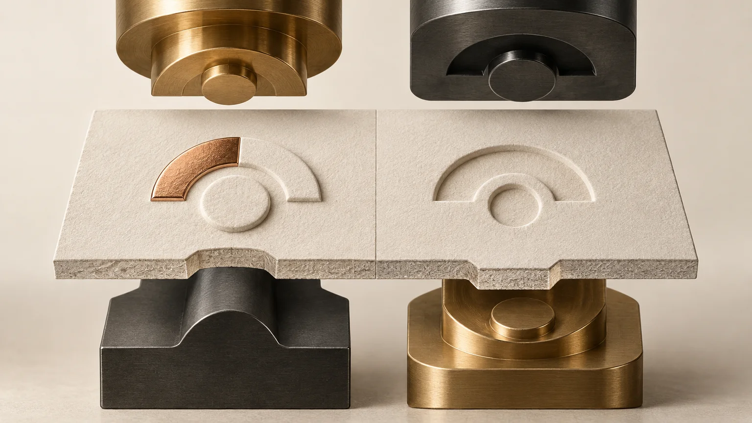
Conventional relief is mechanical. The sheet enters a press between a metal die and a matching counter-die, and pressure forces the material into the available cavity. The resulting shape remains in the stock after the tools separate. From the finished piece’s front side, the formed area reads as raised for embossing or recessed for debossing. Billerud’s overview of embossing and foil stamping illustrates this die-based construction.
The tool face need not create a single flat level. Available treatments include single-level, multilevel, sculptured, beveled, dome-shaped and V-shaped forms. A sculptured emblem, for example, may contain both gradual slopes and several elevations. Describing that job only as “embossed” does not tell the toolmaker enough about the intended profile.
Deeper is not automatically better. As depth increases, sloped or beveled tool geometry can visually narrow letters and rules. The stock must also stretch and compress farther, increasing the importance of its structure and the surrounding design. No universal impression depth, minimum rule width or minimum type size applies across every press, tool and substrate.
Prepare finishing artwork as a production instruction
Create the relief artwork as clean vector geometry on a clearly named finishing layer. Use an unmistakable label such as EMBOSS, DEBOSS or RELIEF TOOLING rather than relying on color alone. State which surface is the read side and whether the effect is blind, registered to print or registered to foil.
The production file should also show trim, folds, scores, die cuts and other nearby converted features. For packaging, flag glue or adhesive areas as well. These elements help the finisher evaluate whether the impression conflicts with another operation or sits in a mechanically sensitive part of the finished structure.
Do not assume that detail surviving on screen will form cleanly. Thin type, small serifs, narrow counters and hairline rules are less reliable candidates for forming, particularly when a sculptured or beveled profile reduces their apparent width. Ask the toolmaker to review the actual vector geometry at final size rather than relying on a generic numerical rule.
Stock determines how much relief the design can hold
The substrate is part of the forming system. Domtar recommends soft, thick uncoated paper when a pronounced effect is wanted, but that is a useful direction rather than a universal stock specification. Coatings, fiber structure, caliper and surface character can change how readily a sheet forms and how sharply it retains detail.
Grain direction also affects paper behavior during printing and finishing. Confirm it when the relief sits near a fold or when the piece has demanding conversion requirements. The interaction is especially important on cartons and folded covers, where relief cannot be considered independently of cracking, stiffness and fold performance. See how paper grain direction affects folding for the related construction mechanics.
Finalize the intended stock before tooling whenever possible. A test on a convenient substitute may not predict the result on the production sheet. Ask the finisher whether the chosen stock, tool profile, impression depth and nearby converted features should be evaluated with a physical sample.
Registered foil and relief need a shared plan
Foil stamping and relief are separate operations, although some equipment can combine them. There is no single universal sequence for every foil-and-relief job; machinery, tooling, design and supplier workflow determine whether operations are combined or separated.
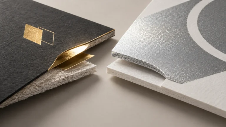
If a logo uses both foil and relief, specify whether the foil sits on the raised face, inside a recess or merely near the formed area. Small offsets that look negligible in flat artwork may become obvious when a reflective edge meets a highlight or shadow. The broader comparison of foil and metallic ink production differences can help establish whether transferred foil is necessary before relief registration is added.
Digital raised gloss is a different construction
Some digital systems build a raised effect by printing multiple clear-gloss layers. Roland DG documents this as thick gloss printing, with adhesion or primer requirements potentially requiring trial output. The result may provide visible and tactile surface height, but it is an applied build-up rather than a mechanically formed recess in the sheet. It therefore cannot create a conventional deboss, and it should not be treated as a universal substitute for die embossing.
Worked production brief: a foiled carton logo
Consider a small logo on the front panel of an uncoated folding carton. A useful production brief would identify the outside panel as the read side, name the exact stock, and define whether the logo should rise above the surface or sit below it. It would also state whether the relief is blind or registered to the foil.
- Supply the logo as final-size vector artwork on a named relief layer.
- Show the foil area separately instead of merging foil and relief into one ambiguous shape.
- Include trim, score, fold and glue-area references in the production view.
- Ask whether thin letters or counters require enlargement for the selected tool profile.
- Confirm the planned foil-and-relief sequence with the actual finisher.
- Approve a physical result for relief direction, detail retention, registration, surface damage and panel distortion.
If the project still needs a supplier route rather than only file preparation, compare capabilities for the exact stock, tooling and finishing combination. Broader custom printing options may provide a useful starting point, but the decisive answers should come from the facility that will make the die and run the job.
Make the decision before the file is locked
Use blind debossing when you want quiet, recessed tactile detail without another graphic element controlling alignment. Use embossing when raised prominence and changing highlights are central to the design. Choose registered relief only when its relationship to ink or foil justifies the added alignment demand.